 |
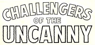
| All lettering on this page by Kid Robson |
(The following piece started life as a comment in response to a post on someone's blog. Then I realized it would make a nice entry on my own. So, with a little editing, here it is for your consideration.)
***
***
I used to earn my main source of income as a letterer on various British comics. One such comic was - and still is - a cult comic in Britain. I was known for doing good display lettering, like sound effects and logos, etc. That's why I worked for them.
One day, a "new" editor (who'd been transferred from a discontinued comic) asked me to stop doing my sound-effects (Wham!, Smash!, Pow!, etc.) in the manner I was doing them. "It makes the strips you work on look like a Marvel Comic!", he said. You see, the traditional British way had been just to do basic, black lettering to signify a sound - serviceable, but uninspired - often looking like it had been stuck over the artwork rather than being a part of it. |
| Unpublished logo |
My approach was to integrate the effects into the artwork, and gave them the kind of outline and detail that suggested the sounds they were trying to convey. Art Simek and Sam Rosen had their own styles, sure - but they didn't so much letter comics the "Marvel Way" as letter them the best and most effective way they could be done. That's what I tried to do. The previous and subsequent editors all appreciated and encouraged the extra effort I put into my work, but this editor just didn't get it. He'd rather I lettered in a bland, non-descript and unspectacular way as opposed to the best and most dynamic way to do it, simply because he didn't want the comic to look like a Marvel comic - even 'though Marvel comics looked better. Simply put - "Don't do it as good as the company that does it best because we don't want people thinking we're them." Crazy or what?
 |
| Hand-lettered flyer. |
The point of my reminiscence? If you've ever wondered why a comic sometimes doesn't look as good as it could do, it's not always the fault of the actual contributors.

No comments:
Post a Comment