 |
Pencils by Jack Kirby
|
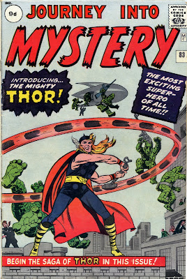
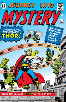
Following on from the previous post, here's a few more examples of what a difference colour (or, to be more precise, the choice of colour) can make to a printed page. The example on the left is the original JOURNEY INTO MYSTERY #83 as it appeared back in 1962. Compare it with the brighter, recoloured version from the first printing of MARVEL MASTERWORKS Vol. 18, 1991/'92. (Note: A superior version, more faithful to the original, appears in the recent softcover edition of THOR MASTERWORKS.)
 |
Inks by Joe Sinnott
|
Now compare both of them to the magnificent TOM CHU coloured presentation (below), reproduced in the TALES OF ASGARD hardcover volume, which also reprints the origin tale from J.I.M. #83. (Unfortunately, despite the superb colouring, the artwork has been retouched in places, having been restored from the reprint in THOR #158. For a more faithful reprint of this classic story, see the softcover MASTERWORKS edition, referred to above.)


No comments:
Post a Comment